Eudemonia
UI/UX Design • Product Design • Brand Identity
Eudemonia is an app that sets out to solve the problems medication users face every day – missed doses, missed appointments, busy schedules, and keeping track of prescriptions.


Problem Area
Patients dealing with a multitude of medication issues.
Target Audience
Anyone who takes medications, primarily more than one prescription medication.

TOP INFLUENCERS & COMPETITORS
Pill & Med Reminder is probably the closest comparison to what the app should look and feel like inside, but it’s missing a lot of the actual functionality that Eudemonia will offer.
Drugs.com has a lot of the information that users will be able to be able to find within the app. They have reviews, side effects and some interactions on their site.
Care/Of and Pill Pack (both trendy vitamin delivery services) are both going to inspire the actual design of the final app (look and feel).
Most of the brands and apps listed are competitors as well as influencers in different aspects of the app design.
USER FLOW DIAGRAMS
Book Video Appointment:
This user flow satisfies the primary user persona, because he needs to be able to quickly make his appointments, as well as have an easy check-up through video with his busy schedule.
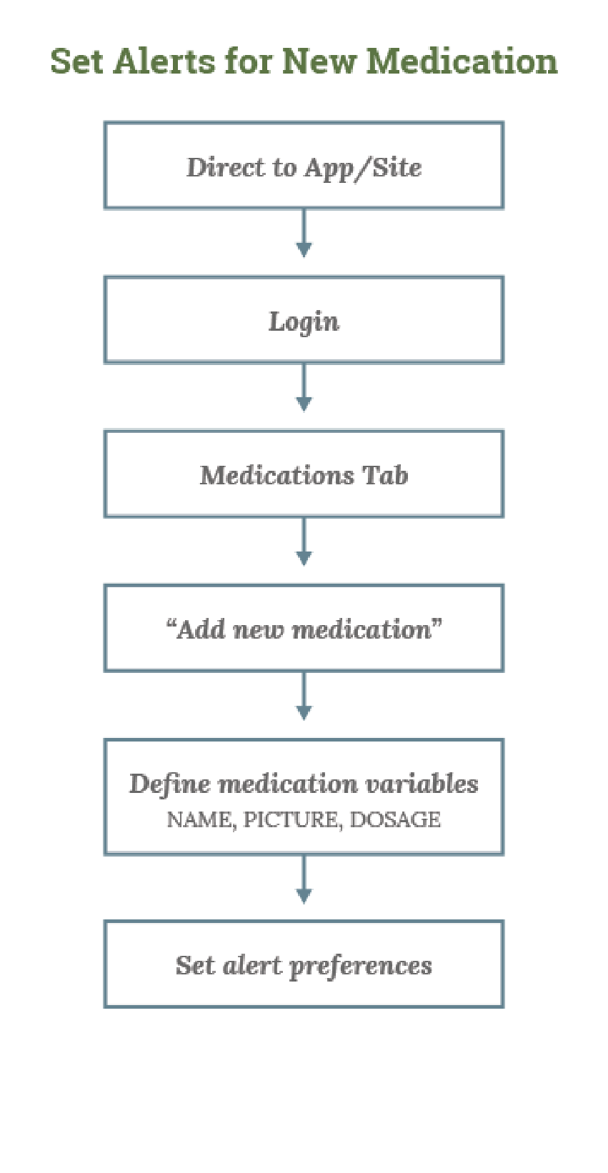
Set Alerts for New Medication:
This user flow satisfies the secondary user persona because she needs to remember when to take her medications and when to give them to her husband (there would possibly be a “family” feature added).

Combined User Flow:
Combined user flow meets requirements of the primary persona mainly, but also shows a few of the screens that the secondary user will see, such as “add a new medication” (Dotted lines represent option within flow)

APP NAVIGATION STRUCTURE

wireframes
Login Page
The login screen where existing users can sign in or request assistance with a forgotten password, and new users can sign up for an account.
We are going to assume that for the remainder of this wireframe, the user has an account already.

Homepage & Navigation
The main homepage screen a user sees after logging in. Icons and some text lets the user know what options are available to them on each page.
An example of the expanded navigation that shows some of the smaller content pages within the main pages.


Medications Page
On the main medications page, a user sees all the medications they’ve input for themselves, the dosage, and last refill date. The notification/alert to the side might indicate that it’s time to refill a medicine, or that there are possible drug interactions for that medicine to be aware of. You can click on the medication to see what the alert is.
You also have the option to add a new medication from this page.

Add Medications Page
When you begin typing a medication name, the app will start to auto-suggest the one a user is searching for from a database of medications. They can input dosage, frequency, how many pills to take, etc here.
More implementation could be done later to add an option of scanning a medicine in.

Refill Pages
Gray dots indicate where icons will go. I didn’t want to make this wireframe into a simple form because a few of my users mentioned seeing an actual calendar usually helps them when deciding days to book appointments, schedule pickups, etc. The same with seeing a list of times drawn out on another page, and the medicines will be able to select multiples to refill if needed.


Fulfillment Pages
Refill to have delivered, with the option to choose from saved addresses.
Refill to pick-up with nearby locations that can fulfill the order during the time slot and date selected.


Confirm details of the refill before sending it in.
Confirmation that a notification will be sent to your doctor to have the script approved.


USER RESEARCH: Goals & Questions
Goal 1
Identify negative experiences and problems patients deal with in managing their day-to-day health and in all aspects of healthcare.
Goal 2
Understand current interactions patients have with their doctors’ office and vice versa, and look at how to improve or simplify those interactions.
Goal 3
Gauge which difficulties are most troublesome to both parties, and find which problems can be solved through use of a third-party app.
COMBINED USER FLOW
Patients:
Do you feel it is easy to find out information on interactions between your current medications and new ones you may be prescribed?
Do you need to go and see a doctor to obtain refills or dose changes? What are some challenges you face with this?
Do you need to go and see a doctor to obtain refills or dose changes? What are some challenges you face with this?
Doctors:
Do you feel as though you are currently able to take on every patient in an adequate amount of time? If no, why do you think that is?
Do you think it would be beneficial if you were able to have office staff communicate with patients on your behalf (after verification) and send for refills of medicine in lieu of some appointments?
How many patients do you see on average weekly? About how many of those patients are being seen strictly for refills or dosage increases on medications?
